Calculate CSS padding-bottom percentage from width and height, or find container width or element height from a padding ratio for responsive boxes.
- All Miscellaneous Calculators
- Text to Image Ratio Calculator
- Pixel to Percentage Calculator
- Scale Calculator
- Pixels to Inches Calculator
- Resolution Calculator
Padding Ratio Formula
The padding ratio is the percentage used in CSS to keep an element at a fixed aspect ratio. For the common padding-bottom method, the percentage is based on the element width.
- Padding % is the CSS padding-bottom value.
- Width is the container width or aspect ratio width.
- Height is the target element height or aspect ratio height.
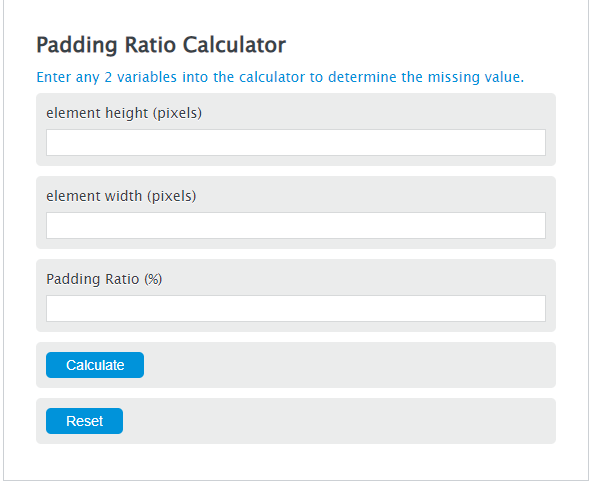
The Padding % mode takes a width and height, then returns the padding-bottom percentage needed to preserve that ratio.
The Size From Padding mode lets you enter any two values from width, height, and padding-bottom. It calculates the missing value using the same relationship.
If you use width and height as a ratio, such as 16 and 9, the units do not matter. If you use real dimensions, use matching units for width and height.
Common Aspect Ratios and Padding Percentages
| Aspect ratio | Common use | Padding-bottom |
|---|---|---|
| 16:9 | Widescreen video | 56.25% |
| 4:3 | Standard video or older screens | 75% |
| 1:1 | Square image or tile | 100% |
| 3:2 | Photo layout | 66.6667% |
| 21:9 | Ultrawide media | 42.8571% |
Example Padding Ratio Calculations
Example 1: Find padding-bottom for a 16:9 ratio
You want an element to keep a 16:9 shape.
The CSS padding-bottom value is 56.25%.
Example 2: Find height from width and padding
You have a container width of 800 px and a padding-bottom value of 56.25%.
The element height is 450 px.
Padding Ratio Calculator FAQ
Why is padding-bottom based on width?
In CSS, percentage padding on an element is calculated from the width of its containing block. That includes padding-bottom. This is why a percentage can create a predictable height from a known width.
What padding-bottom gives a 16:9 ratio?
A 16:9 ratio uses 56.25% padding-bottom. The calculation is 9 divided by 16, then multiplied by 100.
Should I use the padding-bottom method or aspect-ratio in CSS?
Use the CSS aspect-ratio property when you only need modern browser support. Use the padding-bottom method when you need the older responsive ratio technique or when working with existing code that already uses it.