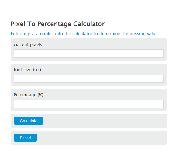
Convert pixels to percentages, vw/vh, or font-size units by entering element, container, viewport, or base font-size values and get CSS-ready results.
Related Calculators
- Pixel Resize Calculator
- Pixels to Inches Calculator
- DPI Calculator (PPI)
- Resolution Calculator
- CM to Pixel Calculator
- Pixels Per Degree to Resolution Calculator
- All Unit Converters
Pixel To Percentage Formula
Variables:
- PP is the percentage (%)
- P is the element size (in pixels or any consistent unit)
- RS is the reference size (in the same unit as P)
To convert a size in pixels to a percentage, divide the element size by the reference size, then multiply by 100. In CSS, the “reference size” depends on the property (for example, font-size: % is relative to the parent element’s font size, while many layout percentages are relative to the containing block’s width).
| Pixels (px) | Percent (%) |
|---|---|
| 4 | 0.4 |
| 8 | 0.8 |
| 12 | 1.2 |
| 16 | 1.6 |
| 24 | 2.4 |
| 32 | 3.2 |
| 40 | 4.0 |
| 48 | 4.8 |
| 64 | 6.4 |
| 80 | 8.0 |
| 96 | 9.6 |
| 120 | 12.0 |
| 160 | 16.0 |
| 200 | 20.0 |
| 240 | 24.0 |
| 320 | 32.0 |
| 400 | 40.0 |
| 600 | 60.0 |
| 800 | 80.0 |
| 1000 | 100.0 |
| Percentage = (element size ÷ reference size) × 100. Table assumes reference size = 1000 px. For em/rem, this calculator assumes the common default: 1em = 16px and 1rem = 16px (your site’s CSS may differ). | |
How to Convert Pixels To Percentages?
The following steps outline how to calculate a percentage from a pixel value relative to a reference size.
- First, determine the element size (in pixels).
- Next, determine the reference size (in pixels).
- Next, gather the formula from above: PP = (P / RS) * 100.
- Finally, calculate the percentage.
- After inserting the variables and calculating the result, check your answer with the calculator above.
Example Problem :
Use the following variables as an example problem to test your knowledge.
element size (px) = 12
reference size (px) = 15
PP = (12 ÷ 15) × 100 = 80%
Frequently Asked Questions
What is the significance of converting pixels to percentages in web design?
Converting pixels to percentages is useful in web design for creating responsive layouts. Percent-based sizing scales with a chosen reference size, helping elements adapt across different screen sizes.
How does changing the reference size affect the pixel to percentage conversion?
Changing the reference size directly affects the result because the calculation divides the element size by the reference size. A larger reference size produces a smaller percentage for the same pixel value, and a smaller reference size produces a larger percentage.
Can this formula be applied to elements other than font sizes, such as margins or padding?
Yes—use the same ratio formula, but make sure you use the correct reference size for the CSS property you’re working with. For example, font-size: % is relative to the parent’s font size, width: % is relative to the containing block’s width, and (in CSS) percentage padding values are relative to the containing block’s width (even for top/bottom padding).